Using the type I made at SBT, I made a small web flier for my birthday party. I think it came out quite nice and the colours sit well. I will start using new type, hand made soon.
Tuesday, 29 September 2009
Tuesday, 15 September 2009
Leeds Fixed Gear
I did this quick thing for Sam's banner for the Leeds Fixed Gear blog. Overall pretty happy, did'nt take long. Its been changes and re-jigged a bit which is annoying but hey ho. I think i'm going to do one a month to keep it fresh. Same style of course.
www.fixedgearleeds.blogspot.com
www.fixedgearleeds.com
Wednesday, 2 September 2009
Shortcuts Brief
This was just a small brief that the guys set for me when things weren't to busy. Because they couldn't believe that I never really use shortcuts or InDesign, they set me this to ram it into my head and make my work move along quicker.
The second one was my favorite because I'm getting on with some hand drawn type. I think it worked pretty well and I'm pleased with the result. It is something I want to expand on and you can see in the result that the weeks of work have taken influence in the work.
Screen Yorkshire
This is a flier for a magazine. The company is one of the most frequent clients for SBT. It is called Screen Yorkshire and it sorts out films like This is England and stuff. Pretty simple Ad but it looks pretty cool.
National Blood Service
These are some fliers for the National Blood Service. These titles are a bit cheesy and they made me change the colour from red to yellow, but I think that is there corporate colours. Quite pleased with the designs, they don't look to bad.
Kitchn Billboards
This is a new kitchen company from Denmark moving to England. I had to mock up these billboards for a presentation pitch for the company. They look OK. Kitchn means rough and good or something silly. It sounds a bit dirty and stupid to be honest.
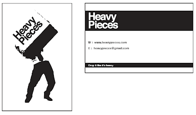
Heavy Pieces
This is for a music blog that is starting in Leeds called Heavy Pieces. I did loads and loads of designs for this, but he picked the most simple stuff. Business cards, compliment slips and letter heads.
Headrow Photographic Competition
This client wanted a A3 leaflet, that folded out into a poster. This was the result. One of the first client based projects I worked on. New to InDesign.
Headrow Housing Final
Here is the final Annual Report, page 1 to 12. Overall, I'm pretty pleased with it, but its nothing like the one I liked the most. But its cool that a load of copy's have been made. I'll get sent a copy once I receive it.
Headrow Housing
After telling me they wanted it a little more like a newsletter this is what I came back with this layout. They wanted to combine the last design with this layout.
Headrow Housing
This was my winning pitch for the annual report. I really liked the look of this, and it was the one that took me the longest.
Headrow Housing
These were the first pitches for the annual report for Headrow Housing. They pretty much wanted boring stuff and that's what they got.
Hallmark Hotels Ad
This is for the Hallmark Hotel company. Really easy brief, just copy and layout. It went into a magazine and fliers.
Eden Brown Exhibition Stands
These are exhibition banners for the recruitment company Eden Brown. I think these got printed real big, but am yet to see some pictures.
1984 Play
Someone is doing a play that is a re-make of the Orson Wells book 1984. We all sent away some ideas for logos and the woman never got back to us. Haha.
Studio Belly Timber
During my time at Studio Belly Timber (1 month) I learned a lot of stuff. I learned that the client is always right, no matter how much you don't want them to be. How InDesign is amazing and how it is real fun working in the industry.
Here are all the projects I worked on in no particular order.
Subscribe to:
Posts (Atom)


