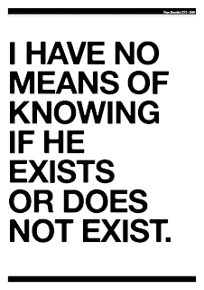
The final negatives for my screen print project called 'Skinny Ships'. Notice some of the pictures and quotes have changes in accordance with the crit outcome. It has made the set all around better and more recognizable.
Monday, 26 October 2009
Thursday, 22 October 2009
Rita and Kate
These are two ideas I chose for elegance. Basically a few people could recognize who Rita Hayworth was so it wouldn't have made sense to use it and even though I think that because she often appears in magazine like Vogue etc she is elegant, it came to my attention that when people think about Kate Moss they think about drugs, partying and Pete fucking Doherty, so that one is also a miss.
The most obvious is the best idea, everyone knows her face as it is one of the most famous in the world. I have picked Marilyn Monroe for the elegant poster.
Wednesday, 21 October 2009
Skinny Ships - Tests
Two ideas I didn't use for Skinny Ships. Bush was representing doubt, but I realized it was a bit cliche and didn't really work. Audrey Hepburn was representing elegance but I liked the tongue - in - cheek idea of Britney because she's horrible.
Tuesday, 20 October 2009
Jacko Type One
These are a couple of variations with type. They would work well when silkscreened and I kind of started them for the sake of it, but developed I think the left hand side on could quite work.
Jacko
Just one idea for a screen print for Headline brief, same headline as all the other Jacko ones but without type or any text. Two colour, could work quite well.
Monday, 19 October 2009
Headline - Jacko
These are some quick ideas for over prints of Michael Jackson. I'm not fully into them, I think they look a bit juvenile but its something I would consider in the future.
Sunday, 18 October 2009
These Are the Brakes - Silkscreens
These are some tests that I did after I was told that I couldn't screen print colour over a black and white image. I did these small tests to see which colours work, how to mix them and what stock they sit best on.
It worked well because in my prints I want the image to be stronger than the text, so having a weaker colour over the black is perfect.
I made stickers and made them editions just for the fun of it, because when I do my final prints, they will be editoned and packaged.
Friday, 16 October 2009
Colour over Halftones
Tuesday, 13 October 2009
Headline
These are two ideas for the headline brief. I like the look of them, especially the one on the right, but don't think i will use it. I want to use a headline from a Michael Jackson story.
This way of creating the images is a good way to do it as it will look nice silkscreened. It is the same way that I created the images of Dracula and The Mummy.
Skinny Ships


These are the five posters I have chosen for the Skinny ships brief. They all represent a word:
Arrogance
Strive
Elegance
Doubt
Values
Some of them have quite deep meanings (Adolf Hitler - bad values), some are quite ironic (Britney Spears - elegant). They will be hand silkscreened. A large half tone image with a semi transparent type and detail over the top. They will be collected into a self promotional package afterwards.
Monday, 12 October 2009
T-shirts
Getting there with all 40 now. Getting back into it was hard, but mega fun. I cant wait to get lots of printing done for my projects.
Pics of it all are here:
Wednesday, 7 October 2009
Headliners
Just a couple of designs i did just in case i come across a headline that has Mummy's or Vampires in it. I really like these designs as they are a lot more intricate that some of the other designs i have done in the past.
Subscribe to:
Posts (Atom)


