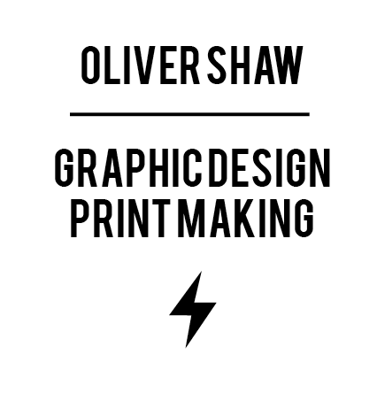


This is the final font chosen. Steelfish Bold. I picked it because its long to fill up the white space a bit and its bold and striking, its easy to make out from a distance. The detail is what the concert is all about and where it is held. I chose this to be small so that the initial reaction from the title draws you into the text.
These will be digitally printed onto a think, foldable stock that doesnt crack. The poster itself is a little smaller than A2, it folds into 3rds to fit into a 7" vinyl sleeve.


No comments:
Post a Comment